By Fiona Villamor on April, 28 2020

We are proud of our Core Team for building an interactive, live COVID-19 global report on Analance. During this challenging time, Ducen presents researchers, public health authorities, and the general public a dashboard that precisely displays key pandemic statistics at a glance. It is accurate, timely, and easy-to-digest. This is what the team hoped to achieve:
- Track global infection statistics.
- See confirmed cases, active cases, recoveries, and deaths in the past 24 hours.
- Get real-time statistics in a live dashboard.
- Drill down graphs, charts, and bubble maps by region.
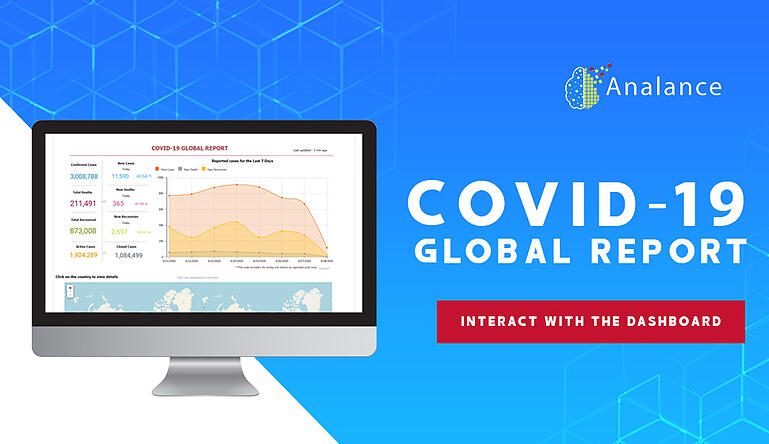
The pandemic data set has been consolidated to report key worldwide statistics at a single glance, including the total numbers and data added in the last 24 hours. The trend for the number of daily new cases is visually represented in an area chart, so one can easily see spikes or dips in the last 7 days.
The interactive bubble map is informative and can be zoomed into to see numbers for infected regions visually and further drill down with a click. Its interactive function allows one to dig deep into data by country/state/city, and statistics are updated automatically across the dashboard.
Track the COVID-19 pandemic in real time. Visualize, interact, and drill down charts and maps to see numbers update by the location.
What this dashboard offers:
1. Reliable updates
The data used is aggregated from authoritative sources such as Bing, the World Health Organization (WHO), the US Centers for Disease Control and Prevention (CDC), and the European Centre for Disease Prevention and Control (ECDC).
Analance offers 20+ data connectors for users to import data from multiple sources and prepare the data for analysis by setting relationships between more than one data set.
2. Real-time data
The report is updated in real time to showcase the latest confirmed cases, recovered cases, active cases, and death cases. You can see the last update time at the top right section of the dashboard.
Analance offers users the option to connect the data in-memory or live. As the name suggests, the second option allows for real-time data to be made available inside the platform.
3. Insights at a glance
Data analytics aims to ease data discovery, among other things. Quickly access infection statistics for each country around the world with easy-to-digest visualizations. Bubble map, number cards, area chart, and pivot chart are some of the visualizations we used for the report.
Analance offers 40+ visualization options for reporting. Visualize all data categories and dimensions with a heatmap, tree map, or a simple bar chart, and customize with beautiful color palettes. Build pixel-perfect dashboards with a grid canvas that automatically splits the canvas, or a free flow dashboard for the creative report builder, to represent visuals as infographics.
4. The information you need
The dashboard allows you to focus only on the information that you need. Click on a country (or drill down further into a region or state) and the dashboard will automatically react and update statistics from that location alone.
Analance offers interactive features for dashboarding and reporting. When dealing with a large data set, drill down is the perfect feature to interact with data at a high level and then down to its granular details.
This is one way to present the pandemic data on a dashboard. There are so many other possibilities.
Create a free 30-day trial account to explore Analance with the same data set. No download required.
ABOUT THE AUTHOR

Fiona Villamor
Fiona Villamor is the lead writer for Ducen IT, a trusted technology solutions provider. In the past 8 years, she has written about big data, advanced analytics, and other transformative technologies and is constantly on the lookout for great stories to tell about the space.